Skip to content
  EN
EN  DE
DE  العربية
Summary: The 7 Basic Quality Tools provide essential techniques to enhance process performance, ensuring that manufacturing and quality control teams can systematically identify and resolve issues. The Quality Tools – Fishbone Diagram, Scatter Diagram, Histogram, Control Chart, Pareto Chart, Check Sheets, and Stratification – serve as practical methods for analyzing defects, visualizing process variations, and improving efficiency. By using them in combination, businesses can proactively monitor production, reduce waste, and implement sustainable quality improvements. Mastering these tools is not just about meeting compliance standards; it’s about driving operational excellence and maintaining a competitive edge in manufacturing.
Introduction
Imagine running a high-precision manufacturing line where even a minor defect can lead to costly rework, waste, or customer dissatisfaction. How do you ensure consistent quality and process stability? This is where the 7 Basic Quality Tools come into play. These tools provide a systematic approach to identifying, analyzing, and solving quality-related issues, ensuring that production remains efficient, defects are minimized, and customer expectations are met.
The 7 QC tools are not just theoretical concepts; they are practical, data-driven instruments that empower quality managers and process consultants to make informed decisions. They are widely used in Six Sigma, Total Quality Management (TQM), and Lean methodologies to enhance efficiency and reduce variability. Understanding and applying these tools correctly can be the difference between inefficiency and streamlined excellence.
How do you ensure consistent quality?
Our EQMS helps you get the most out of the 7 Basic Quality Tools!
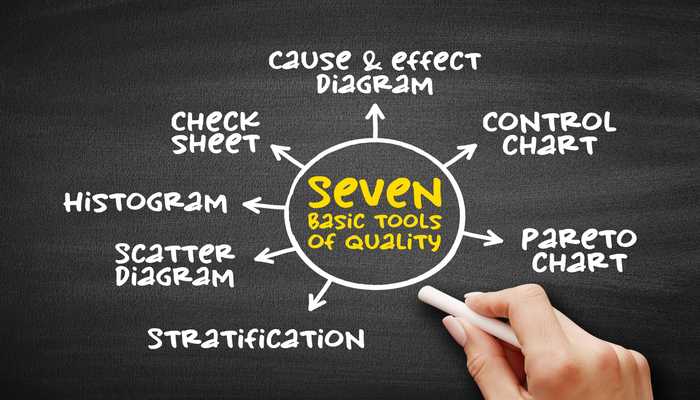
The 7 Basic Quality Control (QC Tools)
Let’s explore the seven basic tools in detail and see how they can be leveraged to drive quality improvements.
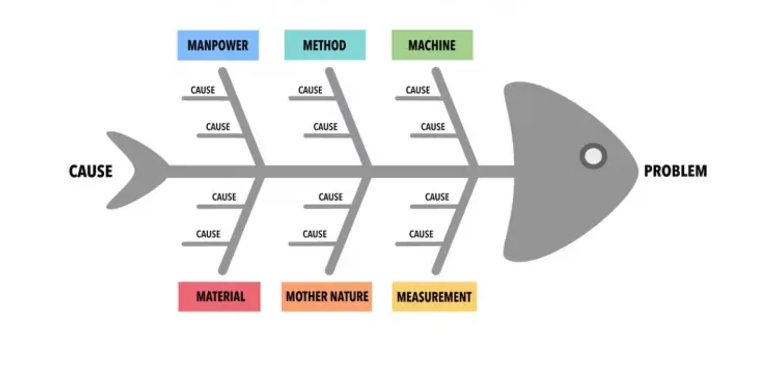
1. Cause-and-Effect Diagram (Fishbone/Ishikawa Diagram)
Have you ever tried to solve a problem but struggled to pinpoint its root cause? The Fishbone Diagram, also known as the Ishikawa Diagram, provides a structured method to identify and categorize potential causes of an issue.
This tool visually maps contributing factors under major categories, typically following the 5M (Manpower, Machine, Method, Material, Environment) or 7M (adding Measurement and Management) approach. By structuring causes into branches resembling a fishbone, teams can systematically analyze root causes and their interconnections.
Example: In an automotive assembly line facing frequent defects, a fishbone diagram can uncover whether the root causes are faulty machinery, insufficient training, or poor-quality materials. Instead of relying on assumptions, quality teams can focus on real issues and implement precise corrective actions.
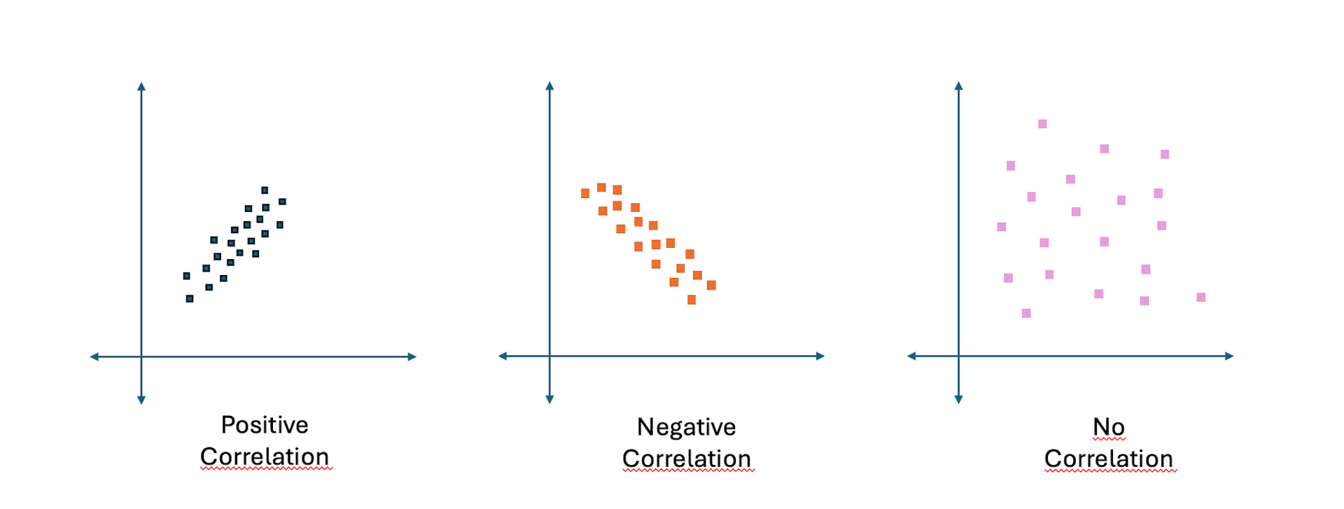
2. Scatter Diagram
Ever wondered whether two variables in your production process are connected? A Scatter Diagram provides clarity by plotting data points on a graph to detect patterns and correlations.
This tool typically reveals three types of relationships:
- Positive Correlation: As one variable increases, the other also rises (e.g., higher machine temperature leading to increased defect rates).
- Negative Correlation: As one variable increases, the other decreases (e.g., reducing machine speed improving precision).
- No Correlation: No clear relationship exists between the variables (e.g., machine temperature and product color if they are unrelated).
By analyzing scatter diagrams, manufacturers can identify whether factors like humidity, material composition, or machine settings affect product quality. This enables data-driven adjustments to optimize production and reduce defects.
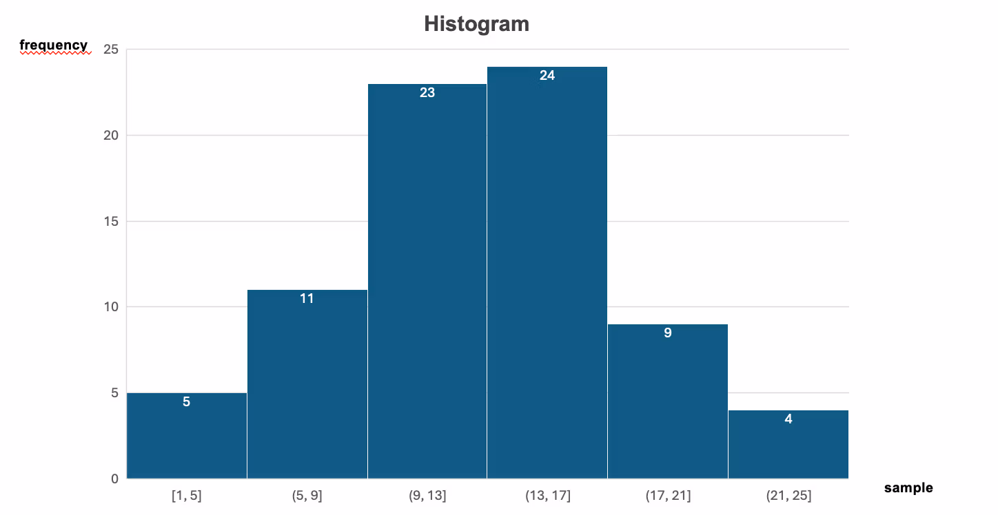
3. Histogram
How can you quickly understand how defects or process variations are distributed? A Histogram provides a clear visual representation of data distribution, making it an essential tool in quality control.
Unlike simple bar charts, histograms group data into intervals (bins) and display their frequency, helping identify patterns and trends.
- X-Axis: Represents the data intervals (e.g., weight ranges, defect counts).
- Y-Axis: Shows the frequency of occurrences within each interval.
For example, in a manufacturing plant monitoring product weight deviations, a histogram can reveal whether most products fall within the desired range or if excessive variation exists. By analyzing a histogram, teams can detect trends, spot outliers, and take corrective action before small deviations turn into major quality issues.
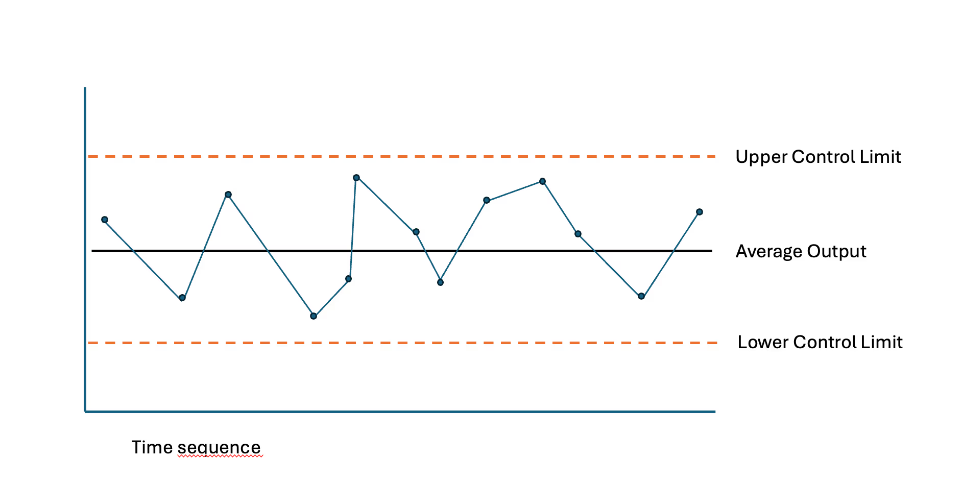
4. Control Chart
Maintaining a stable process is the foundation of quality assurance. Control Charts help achieve this by continuously monitoring process variations and distinguishing between common (expected) fluctuations and special (unexpected) causes that require intervention.
The chart consists of:
- Central Line (CL): The black line represents the average process output.
- Upper and Lower Control Limits (UCL & LCL): The dashed lines define the acceptable range of variation.
- Data Points & Time Sequence: The blue points and connected line track measured values over time.
As long as data points remain within control limits, the process is under control. Shifts, trends, or points outside the limits indicate potential issues that require corrective action.
Example: In pharmaceutical manufacturing, a Control Chart ensures tablet weight stays within safe limits, preventing defective batches and regulatory non-compliance.
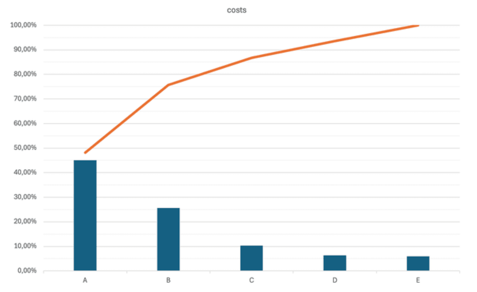
5. Pareto Chart (80/20 Rule)
Not all problems have the same significance. A Pareto Chart, based on the 80/20 Principle, helps identify and prioritize the most critical factors by showing that 80% of issues often arise from just 20% of causes.
This chart ranks problems in descending order of frequency or impact, allowing businesses to focus on high-priority areas first.
- Bars (Left Y-Axis): Represent different categories ranked by their contribution to the overall issue.
- Cumulative Line (Right Y-Axis): Shows the cumulative percentage of the total impact.
By addressing the most frequent or costly factors first, companies can maximize efficiency and resource allocation.
Example: If a factory reports 100 defects per month, and 80% of these defects originate from just two recurring issues, fixing those problems first will yield the greatest improvements. Similarly, in cost analysis, a Pareto Chart can highlight that a few cost drivers contribute to the majority of expenses, helping businesses optimize spending decisions.
6. Check Sheets
Data-driven decisions rely on accurate and structured information, and Check Sheets provide a simple yet effective way to collect real-time data on defects, process deviations, or compliance issues.
There are different types of check sheets, each serving a specific purpose:
- Tally Sheets: Record the frequency of defects, helping identify recurring issues.
- Defect Location Sheets: Map problem areas on products to pinpoint common failure points.
- Process Monitoring Sheets: Track steps in a workflow to ensure consistency and identify bottlenecks.
Example: In a food production facility, a check sheet could be used to log contamination sources - such as specific machines, handling stages, or ingredient batches. By analyzing this data, teams can pinpoint weak spots in hygiene measures and take targeted corrective actions to prevent safety risks and compliance violations.

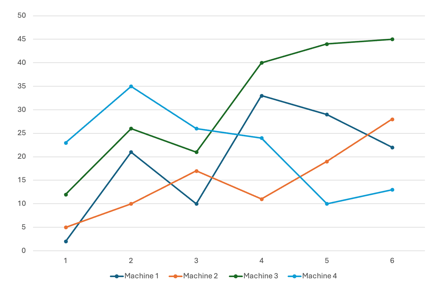
7. Stratification
Data can be misleading if not analyzed correctly. Stratification helps by breaking down large datasets into meaningful categories, making it easier to uncover hidden trends and root causes.
This method involves dividing data into layers based on key factors such as:
- Shift timings (e.g., day vs. night shifts)
- Material batches (e.g., different suppliers)
- Machine performance (e.g., output variations across different machines)
In the chart, performance data from four different machines is plotted over time. Instead of looking at overall production trends, stratification highlights variations between machines, helping businesses detect which machine is underperforming or experiencing irregularities.
Example: A factory experiencing inconsistent production output might use stratification to reveal that one specific machine has more frequent fluctuations, possibly due to maintenance issues or operator influence. By isolating the problem, corrective actions can be more precise and effective, rather than applying broad and inefficient fixes.
Integrated Strategies for Effective Quality Management
The true power of these tools emerges when they are used in combination. Instead of treating them as standalone solutions, organizations can integrate them into a structured problem-solving approach:
- Check Sheets & Pareto Charts: Collect real-time data and prioritize critical defects.
- Scatter Diagrams & Fishbone Diagrams: Identify correlations and root causes
- Histograms & Control Charts: Monitor variations and ensure stability
For example, a manufacturing company facing rising defect rates could:
- Use Check Sheets to track defect frequency.
- Analyze Pareto Charts to focus on the most frequent defects.
- Apply a Fishbone Diagram to determine root causes.
- Validate findings with Scatter Diagrams and Histograms.
- Implement process improvements and monitor stability with Control Charts.
This structured approach prevents firefighting and fosters sustainable quality improvements.
What are common mistakes when using the 7 QC tools?
The 7 QC tools are powerful for quality improvement, but common mistakes can limit their effectiveness. One major issue is using the wrong tool for the problem, such as applying a histogram when a Pareto chart would be more effective. Another mistake is incorrect data collection, leading to misleading results. Companies also often fail to train employees properly, resulting in inconsistent use. Additionally, some organizations use the tools in isolation instead of integrating them into a structured problem-solving approach like PDCA or DMAIC. Lastly, ignoring root causes and relying only on surface-level data analysis can lead to repeated quality issues.
Harnessing the 7 Tools for Predictive and Preventive Excellence
In today’s manufacturing landscape, quality is not just a compliance requirement – it is a competitive advantage. The 7 Basic Quality Tools empower organizations to transition from reactive problem-solving to proactive process optimization. By mastering the Q7-tools, quality professionals, consultants, and managers can create robust systems that ensure efficiency, reduce waste, and enhance customer satisfaction. Whether you’re implementing Six Sigma, Lean, or TQM, these tools provide the foundation for operational excellence.
FAQ | 7 Basic Quality Tools
What are the basic 7 QC tools?
- Cause and effect diagram (Fishbone diagram or Ishikawa diagram)
- Control chart (Shewhart chart)
- Pareto chart
- Histogram
- Scatter diagram
- Check sheet
- Stratification or Flowchart
Why are the 7 basic quality tools essential in manufacturing?
The Q7 Tools enable systematic problem-solving and defect reduction. Their simplicity allows teams to make data-driven improvements quickly. Using them enhances process stability and product quality.
What are the 7 principles of quality management?
- Customer focus
- Leadership
- People engagement
- Process approach
- Continuous improvement
- Evidence-based decision-making
- Relationship management
Are the 7 basic quality tools applicable beyond manufacturing?
The seven basic quality tools are widely used in healthcare, logistics, and service industries. Any process-driven field benefits from structured quality analysis. Their universal applicability makes them indispensable.
What’s the best order to use the 7 quality tools in problem-solving?
Start with a Check Sheet, one of the essential Quality Management Tools, to collect data. Use a Pareto Chart and Fishbone Diagram to identify and prioritize causes. Control Charts validate process stability.
What is the key distinction between Quality Assurance (QA) and Quality Control (QC)?
QA takes a proactive, process-driven approach aimed at preventing defects by optimizing production processes. In contrast, QC is a reactive, product-focused approach that detects and corrects defects in the final product.
What is six sigma in quality?
Six Sigma is a data-driven methodology aimed at optimizing business processes by systematically identifying and eliminating defects. It leverages statistical analysis to minimize process variation, ensuring greater consistency and reliability in operations. Through structured frameworks like DMAIC and DMADV, organizations enhance quality, increase efficiency, and drive continuous improvement
What is DMAIC in quality?
DMAIC is an acronym for Define, Measure, Analyze, Improve, and Control, representing the five key phases of process improvement. It provides a structured approach to identifying problems, measuring performance, analyzing root causes, implementing improvements, and maintaining control over outcomes. This methodology ensures a systematic focus on optimizing processes, meeting project goals, and addressing both internal and external customer requirements.
How do flowcharts help in process standardization?
They document workflows to ensure consistent execution. Standardized processes improve efficiency and reduce variability. This enhances overall operational reliability.
What insights do control charts provide?
They monitor process stability over time. Distinguishing between normal and abnormal variations prevents defects. This ensures timely intervention before major quality issues arise.
When should you use a histogram in quality control?
Use it to analyze data distribution and detect process variations. It reveals whether deviations are random or indicate systematic issues. This ensures targeted corrective actions.
How can a fishbone diagram (ishikawa) be used for root cause analysis in complex manufacturing processes?
An ishikawa diagram structures root cause analysis by categorizing major influence areas like materials, methods, and machinery. Subcategories help trace interactions between variables, uncovering hidden dependencies. This systematic breakdown enhances precision in identifying and addressing critical process inefficiencies.
Image Credits
© dizain - Adobe Stock